
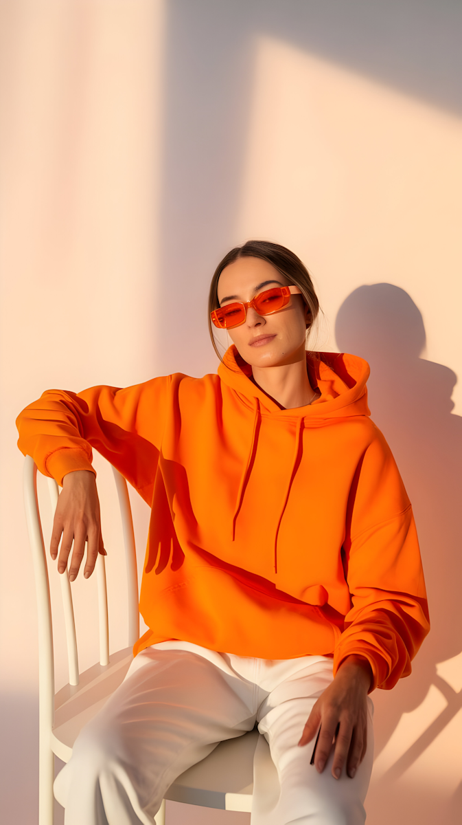
Fieldwise
Overview
Fieldwise is a modern agricultural supply company serving independent farmers with tools, equipment, and services designed for long-term productivity. As the company prepared to expand beyond regional sales into a national audience, they partnered with Climb to rebuild their website and create a marketing film that could clearly communicate their value, credibility, and commitment to the farming community.
The Problem
Fieldwise had earned trust through years of hands-on experience, but their digital presence didn’t reflect the depth or reliability of their offering. Their existing website was difficult to navigate, visually dated, and ineffective at telling their story. Marketing efforts leaned heavily on product specs, missing the human side of modern farming.
Key challenges included:
- A website that felt transactional rather than relational
- No clear narrative explaining how Fieldwise supports farmers beyond products
- Low engagement with digital marketing campaigns
- Difficulty communicating credibility to new customers outside their region
Fieldwise needed a digital experience that felt grounded, honest, and human—while still being strong enough to support growth and lead generation.
The Solution
Climb approached the project by focusing on the people behind the work. The strategy combined a clear, conversion-focused website with a cinematic marketing film rooted in real farming moments.
Website Experience
Climb redesigned the Fieldwise website to prioritize clarity, trust, and ease of use:
- Simplified navigation organized around farmer needs, not product categories
- Clear messaging focused on partnership, reliability, and long-term value
- A modular design system allowing teams to easily add products and resources
- Performance-optimized build for rural connectivity and mobile use
Marketing Film
The marketing film was shot on location, capturing early mornings, long days, and the quiet pride of working the land.
- Documentary-style visuals featuring real farmers
- Minimal narration, letting visuals and natural sound carry the story
- Messaging centered on stewardship, resilience, and generational knowledge
- Short and long-form edits for web, social, and sales presentations
Together, the website and film worked as a unified story—positioning Fieldwise as a trusted partner, not just a supplier.
Project Timeline
- Week 1–2: Discovery, messaging strategy, and film concept development
- Week 3: On-location filming and website wireframes
- Week 4–5: Website design, development, and post-production editing
- Week 6: Launch, asset rollout, and performance tracking
Total timeline: 6 weeks from kickoff to launch
The Outcome
The new website and marketing film helped Fieldwise connect more deeply with their audience and supported measurable business growth.
Results within the first 90 days:
- +92% increase in qualified inbound leads
- +57% increase in time on site
- -38% reduction in bounce rate
- Higher engagement across social and email campaigns featuring the film
- Improved sales team close rates when using the film in pitches
Most importantly, Fieldwise gained a digital foundation that honored their roots while supporting future growth.
Closing
By combining clear digital strategy with honest storytelling, Climb helped Fieldwise translate real-world trust into a modern digital presence—proving that strong marketing doesn’t have to feel manufactured to be effective.
Lume
Overview
Lume is a modern eyewear company creating thoughtfully designed glasses that balance style, comfort, and everyday wearability. As the founders prepared to launch their first collection direct-to-consumer, they partnered with Climb to build a brand that felt elevated yet approachable—designed to live comfortably at the intersection of fashion and function.
The Problem
Lume entered a crowded eyewear market where many brands looked and sounded the same. While their frames were well-designed and affordably priced, their early identity didn’t clearly communicate what made Lume different—or who it was for.
Key challenges included:
- An undeveloped brand identity with no clear point of view
- Messaging that leaned generic and price-focused
- Inconsistent visual direction across packaging, social, and retail assets
- Difficulty building trust as a new, online-only eyewear brand
Lume needed a brand that felt confident, stylish, and human—without the exclusivity or clinical tone common in the category.
The Solution
Climb worked with Lume to create a brand centered on clarity—both literally and emotionally—positioning the company as a daily essential rather than a fashion trend.
Brand Strategy & Identity
The identity system was inspired by light, balance, and simplicity. Climb delivered:
- A clean, modern wordmark designed to feel timeless across seasons
- A soft, neutral color palette paired with subtle accent tones
- A typographic system combining editorial elegance with everyday legibility
- A flexible design system adaptable to digital, packaging, and in-store displays
The brand voice focused on confidence without pretense—highlighting comfort, craftsmanship, and self-expression rather than luxury signaling.
Project Timeline
- Week 1: Brand strategy, audience definition, and positioning
- Week 2–3: Visual identity exploration and refinement
- Week 4: Packaging, frame engraving, and marketing applications
- Week 5: Brand guidelines and launch-ready asset delivery
Total timeline: 5 weeks from kickoff to final brand system
The Outcome
The new brand helped Lume launch with clarity and momentum—earning early traction and building trust with first-time customers.
Results within the first 90 days:
- +176% increase in conversion rate compared to pre-launch tests
- +63% growth in average order value
- +48% repeat purchase rate on second-frame orders
- Strong early engagement across social and email campaigns
- Positive press coverage from lifestyle and design publications
Most importantly, the brand gave Lume a scalable foundation—supporting future frame releases, collaborations, and physical retail expansion.
Closing
By focusing on restraint, warmth, and everyday confidence, Climb helped Lume cut through a saturated market—proving that the most effective brands often say less, more clearly.

Northfall
Overview
Northfall is a premium snowboarding company born in the mountains and built for riders who value progression, craftsmanship, and respect for the terrain. As the brand prepared to move from small-batch boards to national retail and direct-to-consumer sales, they partnered with Climb to define a bold identity that could stand up in shops, on slopes, and online.
The Problem
Northfall had a strong product and loyal early following, but their brand didn’t reflect the quality or philosophy behind their boards. Years of organic growth had resulted in an inconsistent visual identity and unclear positioning.
Key challenges included:
- A logo and visual system that felt dated and generic
- No clear differentiation from mass-market snowboard brands
- Inconsistent application across boards, packaging, and apparel
- Difficulty attracting retail partners due to lack of brand clarity
Northfall needed a brand that communicated credibility, grit, and purpose—without leaning into clichés or extreme aesthetics that could limit long-term growth.
The Solution
Climb worked with Northfall to build a brand rooted in restraint, confidence, and mountain heritage—designed to feel timeless rather than trendy.
Brand Strategy & Identity
The new identity was inspired by elevation lines, winter light, and the quiet intensity of backcountry riding. Climb delivered:
- A bold, minimal wordmark designed for board tops, bindings, and apparel
- A flexible logo system that scaled from small hardware marks to retail signage
- A muted, high-contrast color palette built for snow environments
- A rugged yet refined typographic system emphasizing strength and clarity
The brand voice was sharpened to speak directly to committed riders—focusing on progression, trust, and the relationship between rider and terrain.
Project Timeline
- Week 1–2: Brand discovery, rider interviews, and competitive analysis
- Week 3–4: Identity exploration and visual system development
- Week 5: Board graphics, packaging, and apparel applications
- Week 6: Brand guidelines and launch asset delivery
Total timeline: 6 weeks from kickoff to final brand system
The Outcome
The rebrand positioned Northfall as a credible premium option in a crowded snowboarding market and unlocked new growth opportunities.
Results within the first season:
- 3× increase in wholesale inquiries
- +54% growth in direct-to-consumer sales
- Secured placement in 12 new retail locations
- Sold out flagship board model two months ahead of forecast
- Improved brand consistency across all product lines and marketing channels
Most importantly, the new identity gave Northfall a platform they could grow into—supporting future product lines, collaborations, and global expansion.
Closing
By grounding the brand in authenticity and restraint, Climb helped Northfall stand out without shouting—proving that strong branding doesn’t have to be loud to be powerful.

Velt
Overview
Velt is a modern smartphone company focused on thoughtful design, intuitive technology, and emotional connection. As the company prepared to launch its first flagship device, they partnered with Climb to define their brand and build a website that could introduce Velt to the market with clarity, confidence, and momentum.
The Problem
Velt was entering an intensely competitive smartphone market dominated by established global brands. While their product offered a refined user experience and strong technical performance, their early branding lacked distinction and their pre-launch website failed to communicate a clear point of view.
Key challenges included:
- No cohesive brand system or visual identity
- Messaging that focused on features instead of emotional value
- A website that felt generic and didn’t build trust or anticipation
- Low conversion rates on early waitlist signups
Velt needed a brand and digital presence that felt premium, human, and unmistakably different—without appearing inaccessible or overly technical.
The Solution
Climb partnered closely with Velt’s leadership, product, and marketing teams to reposition the company as a design-led, people-first technology brand.
Brand Strategy & Identity
Climb developed a complete brand system centered around calm confidence and everyday optimism. This included:
- A refined wordmark and logo system
- A warm, modern color palette designed to stand apart from cold, tech-heavy competitors
- A typographic system that balanced clarity with personality
- A brand voice focused on simplicity, joy, and empowerment
Website Experience
The website was designed to tell a story—moving users from curiosity to confidence to action.
- Clear, benefit-driven messaging replacing spec-heavy jargon
- Lifestyle-forward imagery showing the phone in real moments
- A modular design system for easy iteration post-launch
- Performance-optimized build for fast load times and accessibility
Every interaction was intentional, reinforcing Velt’s belief that technology should feel effortless and personal.
Project Timeline
- Week 1–2: Discovery & brand strategy workshops
- Week 3–4: Visual identity exploration and refinement
- Week 5–6: Website UX, copy, and interface design
- Week 7: Development, QA, and performance optimization
- Week 8: Launch support and analytics setup
Total timeline: 8 weeks from kickoff to launch
The Outcome
The launch positioned Velt as a credible, modern alternative in the smartphone space and exceeded internal growth benchmarks.
Results within the first 60 days:
- +212% increase in waitlist signups
- +68% improvement in homepage conversion rate
- +41% increase in average time on site
- -35% reduction in bounce rate
- Featured by multiple design and tech blogs during launch week
Most importantly, the new brand and website gave Velt a scalable foundation—one that could grow with future product launches, campaigns, and markets.
Closing
By aligning brand, messaging, and digital experience, Climb helped Velt launch with confidence in a crowded category—proving that clarity, craft, and restraint can be just as powerful as cutting-edge technology.